Visualizing Arkansas traffic fatalities
/Nathan here again with another guest post. I recently started a master's program at UALR in information science, so I've been following several blogs on statistical programming and visualization. One of the best sites I've found is R-bloggers, which is dedicated to the popular statistical programming language R.
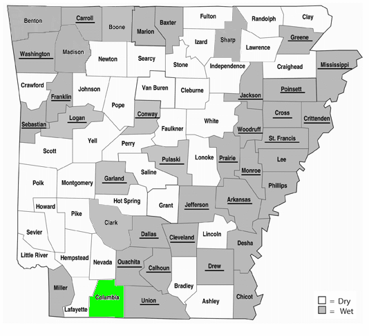
A recent post on R-bloggers by Lucas Puente on mapping traffic fatalities in the US caught my eye. While in private practice, I helped several Arkansas counties through the election process of voting from dry to wet. One of the often-debated issues in those races was whether the highways are safer in dry counties or wet counties. Some people believe roads are safer when alcohol is less available; other people believe that less availability means more stockpiling and more driving drunk over long distances to liquor stores after knocking a few back.
So, I decided to adapt Mr. Puente's R program to create an Arkansas-centric map. In the R-bloggers tradition, I'll explain the code and then present the results.
Part I: The Data
The data comes from two separate sources. First, the traffic fatality data comes from National Highway and Transportation Safety Administration open records, available at ftp://ftp.nhtsa.dot.gov/fars/2015/National/. As instructed by Mr. Puente, I downloaded the file FARS2015NationalDBF.zip and unzipped it.
Next, I had to get the wet/dry status of each Arkansas county. To do this, I created my own CSV (comma-separated value) file from the Arkansas Department of Finance and Administration's wet/dry status page. I uploaded it to a Github public repository so others can use it.
library(foreign) # required to use read.dbf method
accidents <- read.dbf("accident.dbf")
wet_status <- read.csv(file="Ark_counties_wet_dry_status.csv")
Part II: Subsetting and Summarizing the Data
As Mr. Puente did, we're only going to use a portion of the NHTSA's information. However, instead of using the lower 48 states, we're just going to use data for Arkansas. We'll then sum the number of fatalities for all wrecks by county.
ark_accidents <- subset(accidents, STATE == 5)
ark_summary_all <- aggregate(FATALS ~ COUNTY, ark_accidents, sum)
Next, we'll create a vector from the wreck subset to identify just the drunk driving wrecks. We'll use that vector to sum drunk driving fatalities per county, then calculate a percentage of wrecks involving drunk driving fatalities for each county.
ark_accidents_drunk <- ark_accidents$DRUNK_DR > 0
ark_summary_drunk <- aggregate(FATALS ~ COUNTY, ark_accidents, sum, subset=ark_accidents_drunk)
rk_summary <- merge(ark_summary_all, ark_summary_drunk, by="COUNTY", all=TRUE)
ark_summary$percent_drunk <- ark_summary$FATALS.y / ark_summary$FATALS.x * 100
We'll merge that data with the wet/dry status of each county. So we can color the scale differently for wet counties and dry counties, we'll multiply the percentage by -1 for wet counties.
ark_summary <- merge(ark_summary, wet_status, by.x="COUNTY", by.y="FIPS")
ark_summary$percent_drunk <- ifelse(ark_summary$wet, ark_summary$percent_drunk * -1, ark_summary$percent_drunk)
Finally, we'll get the midpoint of the number of drunk drivers, which we'll use to color parts of our map later.
mid <- (which.max(accidents$DRUNK_DR) - which.min(accidents$DRUNK_DR)) / 2
Part III: Preparing the Map Data
The functions Mr. Puente describes in his tutorial have nice features that allow you to subset county and state map data by state.
county_map_data <- map_data("county", region = "arkansas")
state_map <- map_data("state", region = "arkansas")
I merged the county-level information with the wet-dry status. Then (and this is important), I reordered the path information in the county file. Otherwise the plotting function draws extra lines between counties.
county_map_data <- merge(county_map_data, ark_summary, by.x="subregion", by.y="county")
library(plyr) # necessary for arrange function
county_map_data <- arrange(county_map_data, order) # required to draw lines properly
Part IV: Creating the Map
The goal with the visualization was to show the wet/dry status of counties having drunk driving fatalities. So, the percent_drunk column we created earlier, which contains percentages from -100 to 100, serves as the fill. We'll define a continuous scale in different colors to differentiate between wrecks occurring in wet counties and dry counties; by choosing white as the midpoint, we'll be able to see which counties had no drunk driving wrecks in 2015, and it will also give us a gradient that shows some idea of how many wrecks occurred.
map<-ggplot() +
# Add county borders:
geom_polygon(data=county_map_data, aes(x=long,y=lat,group=group, fill=percent_drunk), colour = alpha("grey", 1/4), size = 0.8) +
scale_fill_gradient2(name="Percentage of\nDrunk Drivers", midpoint=0, low="#5ab4ac", mid="white", high="#d8b365", na.value = "white", breaks=c(-100,0,100), labels=c("100% (wet county)", "No drunk driving\nfatalities", "100% (dry county)")) +
# Add state borders:
geom_polygon(data = state_map, aes(x=long,y=lat,group=group), colour = "grey", fill = NA) +
The next goal was to represent the number of fatalities in each wreck by the size of the point. The NHTSA dataset also contains an interesting data point for the number of drunk drivers involved, which we'll use for the color of the point. It appears that one wreck in Pulaski County involved 3 drunk drivers and killed several people.
# Add points (one per fatality):
geom_point(data=ark_accidents, aes(x=LONGITUD, y=LATITUDE, color=DRUNK_DR, size=FATALS), alpha=0.35) +
scale_color_gradient2(name="Number of\nDrunk Drivers\nInvolved", midpoint=mid, low="lightgoldenrod4", mid="firebrick1", high="blue3", na.value="yellow") +
scale_size(name="Number of \nFatalities", range=c(3,8)) +
Finally, we'll use Mr. Puente's other adjustments for cleaning up the map, and then plot it.
#Adjust the map projection
coord_map("albers",lat0=39, lat1=45) +

#Add a title:
ggtitle("Arkansas Traffic Fatalities in 2015") +

#Adjust the theme:
theme_classic() +
theme(panel.border = element_blank(),
axis.text = element_blank(),
line = element_blank(),
axis.title = element_blank(),
plot.title = element_text(size=40, face="bold"))
map
The result is a detailed graphic that shows in a glance that 21 of 75 counties had no drunk driving fatalities in 2015. I'd say that Jefferson County is the place you were most likely to die in a drunk-driving fatality in 2015. If you know anything about Arkansas highways, you can definitely see the outlines of I-30, I-40 west of Little Rock, and I-49 from Ft. Smith to Fayetteville.
2015 Arkansas traffic fatalities. Graphic ©2016 Nathan Chaney.
What do you take away from this visualization?


